via npr:
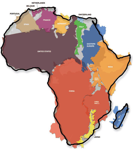
Attention cartography geeks! NPR’s Robert Krulwich takes a looks at websites that let you superimpose maps on top of each other to compare the relative size of various things. For example, what would the dimensions of the gulf oil spill look like if it were superimposed on the US east coast? Or how many big countries could you fit into all of Africa?
What I really like about this post is that I’ve tried to do map overlays manually in the past and it wasn’t very easy to do. Back in the ‘06 Israel-Lebanon war, I took a Google Map image of the war zone and superimposed it over New England. (Haifa to Beirut is about the same distance as Providence, RI to Lowell, MA, in case you’re wondering.) But it was really tough to do, especially given my limited tech skills. So if you’re a map nerd like I am, I hope you enjoy Robert’s post as much as I did. - @acarvin
No comments:
Post a Comment